
01
Audience research & strategy
Our audience research focused on Crafted Liberation’s impact. Our goal was to understand the emotional drivers behind support for this project. We identified two key personas:
- The Drivers: Primarily Iranian women living outside Iran, deeply connected to the Women, Life, Freedom movement.
- The Drivers: Primarily Iranian women living outside Iran, deeply connected to the Women, Life, Freedom movement.
These insights informed every aspect of our brand strategy, guiding the website and content creation to engage these audiences emotionally and effectively.
01
Brand design & copywriting
The brand design embodies RK Collective’s philosophy of ‘design for function, not decoration.’ The aesthetic for RK Collective is minimalistic and modular, using earthy, neutral colours and a clean, sans-serif font. For Crafted Liberation, we introduced a vibrant Persian-inspired colour palette, reflecting the cultural significance of the project. This differentiation in design helped to establish RK as the umbrella brand, with Crafted Liberation as its signature project.
For Crafted Liberation, we introduced a vibrant Persian-inspired colour palette, reflecting the cultural significance of the project. This differentiation in design helped to establish RK as the umbrella brand, with Crafted Liberation as its signature project.


Flyover: Brand refresh & website redesign for a new phase of growth
Flyover began as a cult-favourite takeaway in Sydney’s CBD. When it moved to Redfern and became a full-service restaurant, the brand needed to evolve too. Our role was to translate Flyover’s new direction into a clear, modern experience — online and in-store.
This phase of the project focused on the visual identity, brand messaging and website redesign. Our goal was to show off the big, bold flavours of the Flyover food, build trust and make booking as easy as possible.
Note: This design phase was built on the foundation of audience research and brand strategy. For more on how we guided Flyover’s brand transition, see the Flyover research & strategy case study.
- Refresh the visual identity without losing brand recognition
- Embed the Flyover personality into all brand elements and touch points
- Build a high-converting, easy-to-manage website
- Improve the customer experience and support the team’s day-to-day needs


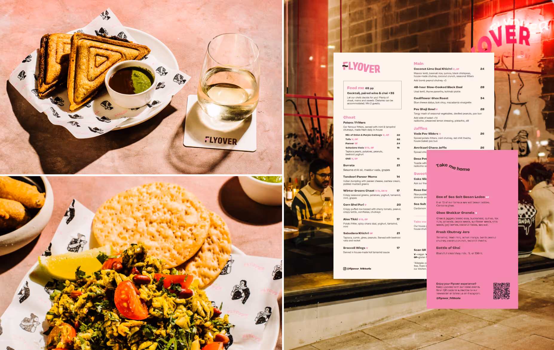

After launching the new brand and website, Flyover saw a 100% increase in sales. Weekend bookings doubled. Corporate catering enquiries grew. And the brand began showing up in all the exciting places — from collaborations with Kylie Kwong to features in Powerhouse Museum exhibitions. Even Billie Eilish picked Flyover while on tour in Sydney.
Most importantly, customers now understood what Flyover stood for — and felt proud to support and bring others along for the experience.
- A strong brand identity builds trust and helps customers connect
- Clear UX and messaging drive real business results
- You don’t need to change everything — just clarify what’s already great
- Brand identity refresh & creative direction
- Photography art direction & styling
- Copywriting & content design
- UX design & Webflow development
Note: This design phase was built on the foundation of audience research and brand strategy. For more on how we guided Flyover’s brand transition, see the Flyover research & strategy case study.
Photos: Flyover / Alana Dimou
Case study presentation visuals by Mayu Ashizawa. Mayu is a Sydney-based graphic designer originally from Tokyo. She brings a sharp eye for aesthetics and strong problem-solving skills to the team at ReCo Digital. She creates visuals that bring a sense of joy and are thoughtfully tailored to suit the project’s goals and audience. Connect with Mayu on Linkedin.
Partner with ReCo
If you have knowledge or innovation worth bringing to the world, we'd love to hear about it. We're based in Sydney, working with visionaries globally.
Relevant Case Study
Crafted Liberation: Audience-led strategy for cultural disruption

Flyover: Rebrand through customer insights

Ipoh: Customer and market research to guide reusable lunchbox strategy

Circular Sydney: Mapping local circular innovation with expert insights and AI

Basalt Orange: Digital audit and ongoing advisory

Flyover: Rebrand and website redesign for a new phase of growth

ReCo Refill: Branding, packaging and e-commerce website

Crafted Liberation: Digital storytelling through website and social media

RK Collective: Branding and website for award-winning product design house

Kakawa Chocolates: Shopify website redesign to boost sales

Wasteland: Using public art to catalyse commercial marine debris recycling

ReCo Refill: Circular packaging and delivery system for plastic-free home essentials

Radish Events: Using AI to transforms food waste management

City of Sydney: 10 years of successful project bids and funded collaborations

Funding communications for impact-driven brands

Funding communications for impact-driven brands